the final assignment's the one that i'm super looking forward to.. it's jus amazing to see all your efforts finally becoming a final product.. how nice.. (:
it started off with having to consider what's the story would it be.. the target group of kids we intend to create the book for.. and what kind of characters should be involved..
one thing about groupwork is that you'll have to decide things together.. compromise and agree.. and finally.. we decided to target mainly on girls aged 6 to about 9.. with a fairytale like story involving the sweet sweet love story with a nice nice ending.. (:
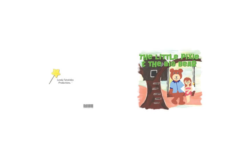

the scriptwriting.. illustrating.. designing.. painting.. and editing was basically the simpler task in this assignment.. though it was really time consuming..
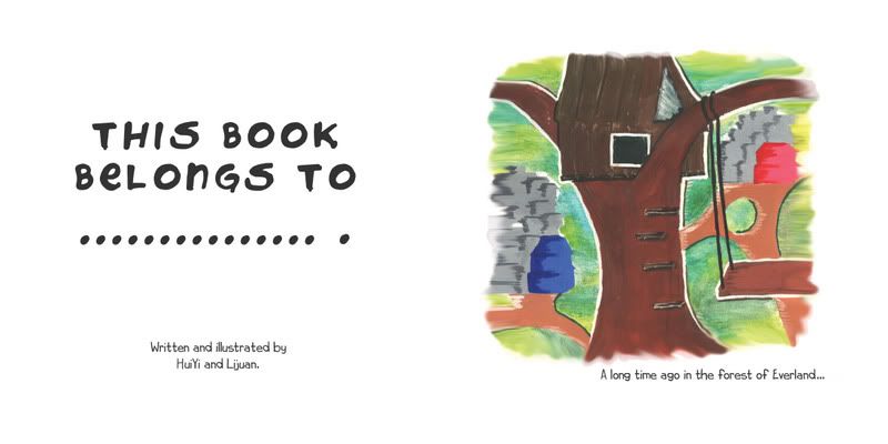
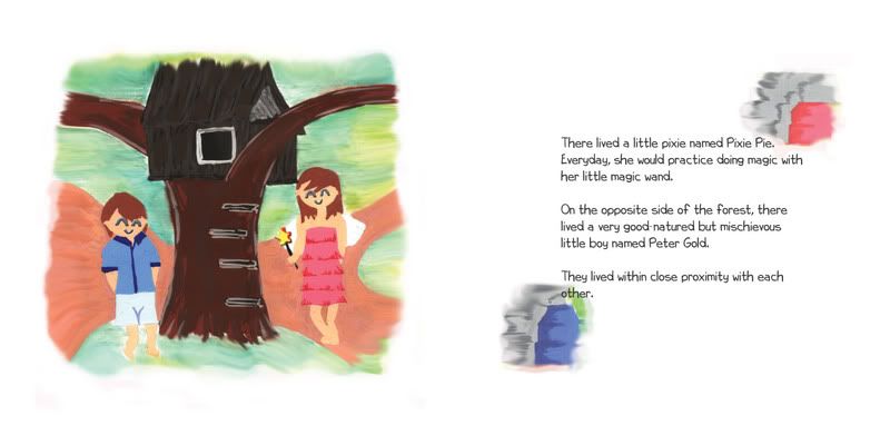
having to plan the amount of space required for the printing.. amount of extra margin that might be needed.. then finally drawing out the intended illustrations.. the overall effect of the coloring that we intend to display.. the color factors.. and also the usage of the principles and theories learnt in class.. it was overall a well-learnt task.. everything that was learnt had to be placed into use.. and yupyup..
but the printing part was pretty tough.. time restrain.. coordination between the printing shop and ourselves.. and every other technical problem that may occur.. but well.. am still thankful that the final product was satisfying.. ^^
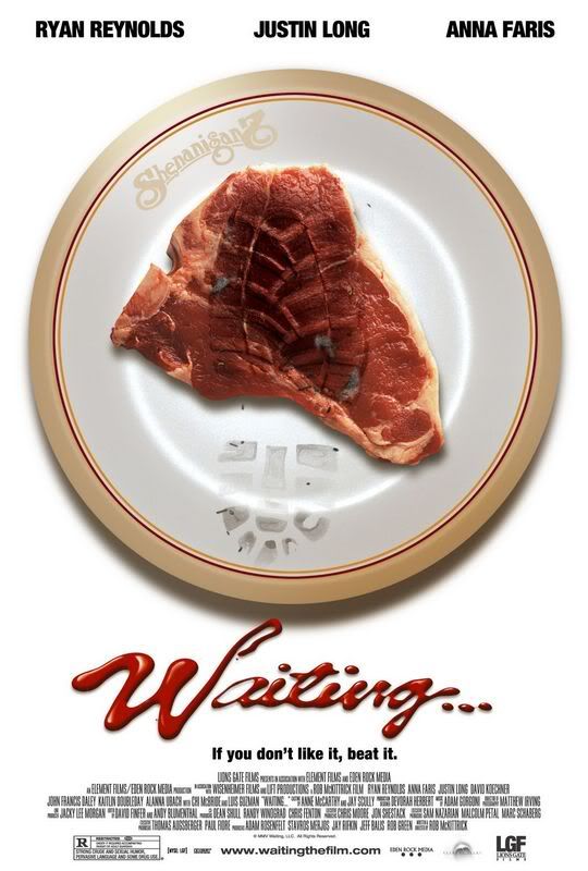
talking about a bad poster.. i would DEFINITELY remember the lousiest poster i've seen on the movie - WAITING.
maybe.. the poster wasn't that lousy afterall.. but.. the show was bad.. so the poster designer might have decided to just come up with anything since the show isn't great either? haha.. that was just my personal opinion.. heehee.. =x
the story was supposed to be a comedy with A LOT of sexual jokes and criticism i would say.. and the whole 1 hour and 30 plus minutes was plain yawning and dozing off session for me and my friends back then when we watched it at some time past 12 midnight.. wat a time to watch a BORING show..
one thing probably that the poster has achieved was it's SUPER UNCLEAR meaning behind the design of the poster that had lead to people catching the show out of plain CURIOSITY..
my experience was..
becos we were left with not many other choices of movies to catch.. this warm-colored RED and YELLOW poster caught our attention in the cold and sleepy night..
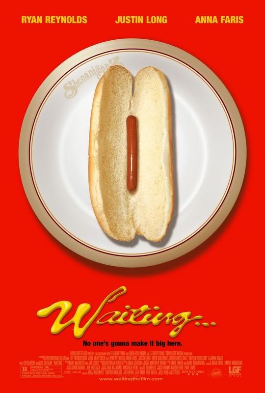
unable to properly derive the meaning of the poster and totally unaware of the synopsis of it.. we decided to try our luck.. and yes.. it's UTTER BAD LUCK. =x
though.. the image did drive us to a certain extend to somehow think that it was something related to food and probably a restaurant.. nothing other than that.. and definitely in no way had we thought that it would be a sexual movie though it was rated nc16 or m18 in singapore..
did some research on the movie.. and i found this poster..
which i dun think i've seen it anywhere in singapore.. and probably this just displayed the similarity of the gestalt principles by using the similar image of food on the white plate.. but still i see and derive nothing else on it..
besides.. many reviewers commented that it was a horrible show too.. haha.. how interesting..
anyway.. what i thought was a bad poster becos of the influence from the BAD movie was afterall.. from the comments from my classmates.. a GOOD poster.. heehee.. and yes..
it possesses the qualities of a good poster.. catchy colours.. derivable meaning related to sex (that was only after explanations from my friends, i really didn't get it in the first place.. hmmm.. ).. borders.. gestalt principles like similarity and proximity.. so afterall.. it's good..
that's besides the point.. we did up the 'we thought it was good' poster from DREAMGIRLS.. (:
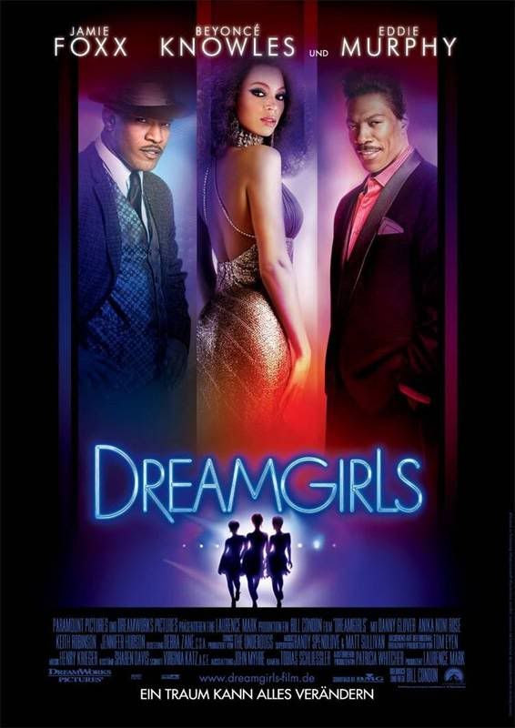
this is good.. the show's good too.. heehee.. obvious biasness.. =x
anyway.. it had a frame which enhances composition and great visual balance.. besides.. it showed similarity and continuity.. an organised.. simplified.. unified and easily understandable poster.. WELL DONE. ^^
becos the 'thought to be bad' poster turned out to be pretty good afterall.. we did a research on another poster..
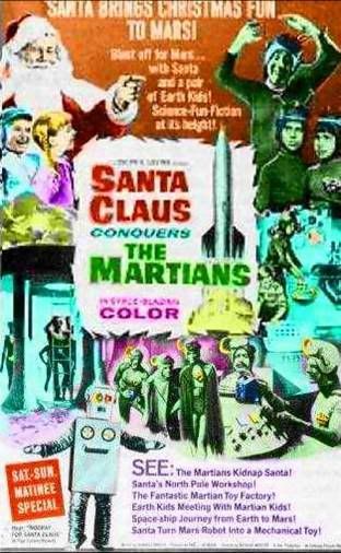
this one.. we had never watched the show before.. and from the poster.. we derived...... NOTHING.
okie.. something.. SANTA CLAUS conquers the MARTIANS.. eh.. yes.. that's basically all.. the poster used like a total of 5 fonts of different colours all over the place.. no borders and images will crowding the entire area..
generally.. no unity no harmony no contrast no nothing.. busy and pretty disturbing poster.. =x
oops.. these are all general opinions and remarks from ourselves.. hope we wouldn't be sued.. *crosses fingers*
a greeting card design based on the theme - LOVE.
the theme that was given was pretty broad.. there's basically different kinds of love that we can do.. motherly love, brotherly and sisterly love, even friends are a GREAT deal of love..
i totally cannot decide on which to do on.. but when i finally realised our focus was on COLORS.. i was already 3/4 way to completion.. which kinda equates DIES.
i have no idea if what i've done is on the right track currently.. but shall wait till tutorial and see what can i edit to make it fit the assignment objectives..
yupyup.
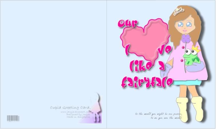
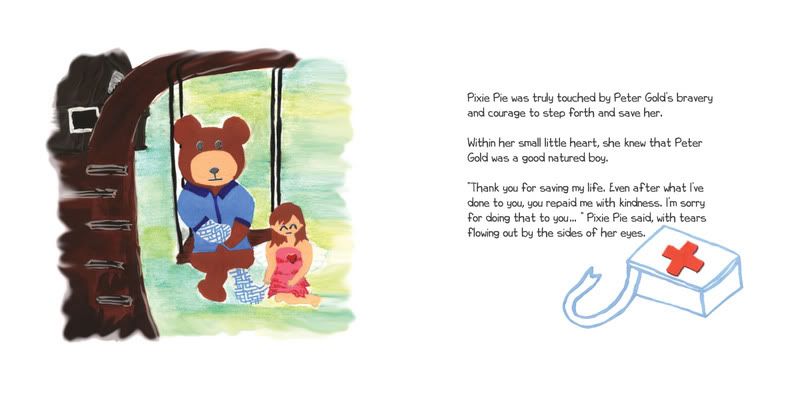
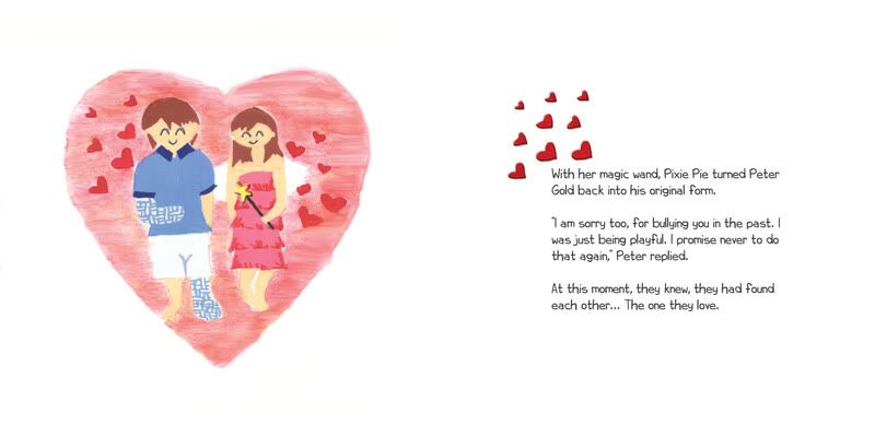
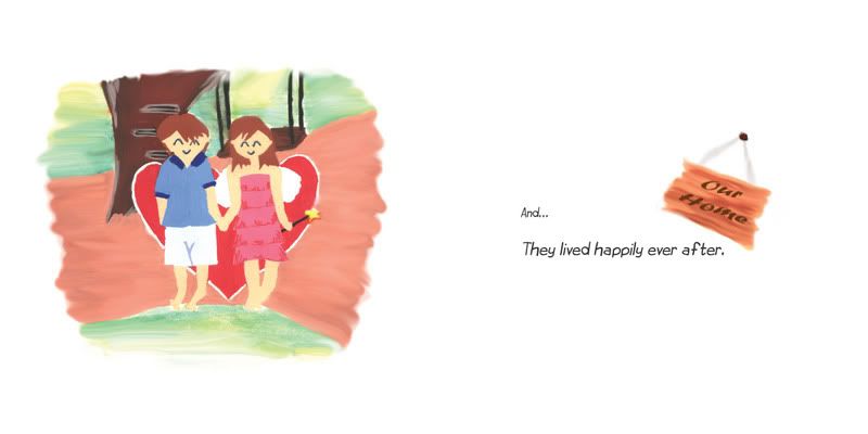
i've always like fairytales.. hence.. i've wished for love like the fairytales which usually end up with a happy ending.. (:
to me.. pastel colors kinda gives me a heart-warming and loving feeling.. thus.. the whole color theme evolves around the pastel colors of pink (romance, love, friendship).. light purple (romance, nostalgic feelings).. and light blue (divine love)..
our LOVE like a FAIRYTALE. ^^
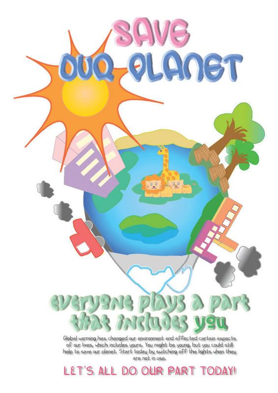
poster designing is the next coming up assignment.. and well.. the theme is SAVE.
the first thing that came to me.. save MONEY, save WATER, save the EARTH.. heehee..
hence.. i thought of global warming and becos of the temperamental weather that we've been experiencing these past weeks and months.. i guess.. a 'save the planet' poster could be a brilliant idea.. and thus..
pen-ed down several points that may have caused global warming.. deforestation.. pollutions of human works.. aftermath effects of melting icebergs.. endangerment of animals species.. rise in water levels and many more.. did up a little research and off i went to design it on photoshop..
i suppose when there's the involvement of a technical machine like the computer.. i became really lazy to actually draft out sketches.. i did bits of the images then compiled everything together.. flipping.. rotating and every other thing i could do to ensure that everything fits nicely into one.. that's probably the wonder of photoshop.. HAHA..
and it was till a later point in time that i realised.. I FORGOT TO LEAVE A BORDER AROUND! haha.. and no worries.. computer works wonders you see.. a few clicks.. and yes.. i achieved the border.. heehee..
the text was added in later and becos my drawings were never professional nor formal.. i decided to target my poster to KIDS.. cute drawings.. colourful image.. everything there is to attract a child more than anyone else.. (:
and therefore.. after long hours of working on it.. my final product..
[edit]
feedbacks from the class was pretty good.. afterall.. it was a poster for kids.. heehee.. there were suggestions of me changing the fonts at the bottom to a more watery feel.. so that it feels like.. they are formed by the water melted from the icebergs.. but.. well..
TOUGH.
it was seriously hard.. and i jus couldn't achieve the effect.. and thus.. left with no choice and a total time constraint that i faced with.. i decided..... forget it.. =x
but it was really a good idea.. and nice visual element.. but it jus couldn't be achieved.. *sigh.
[/edit]
coming up with ideas was easy.. but having to add a twist to it was pretty hard..
i was munching on pineapple tarts one of those days.. and the thought of photographing down the process of making them struck me.. but where can the twist come about?
and.. my cousin can tell me to take a picture of the toilet bowl when it has just been flushed..
MY GOODNESS.. sounds so disgusting.. when everyone currently is drooling over pineapple tarts.. i have to make such a 'DOTS' ending.. hence.. i abandoned the idea..
and thus.. i made do with this.. *just a very simple rough sketch.
i think the storyline is a little 'LAME' and 'RETARDED'.. and pretty 'SADIST' even.. i suppose.. but i couldn't think of anything else better already..
yupyup. (:
photos will be taken and uploaded soon. ^^v.
[edit]
i suppose when you have a model for any assignment.. time management between the people has to be properly managed.. the first time was easy.. cos myself had lesser commitments then.. and my 'model' too was freer then..
but now that i've gotten comments and feedbacks.. and it's time for reshoot.. GOSH! tell me it's just so hard to arrange.. and finally nothing could be done.. becos both our timings just couldn't match..
hence.. i had to make do with whatever was done for the assignment due.. NO EDITING DONE. sobx..
besides.. cos i ain't any professional photographer.. the pictures were.. hmmm.. how do i describe them.. WEIRD? it isn't just as what i kinda expected them to be like.. it's easy to picture.. easy to imagine.. when it has to be done.. it's hard to obtain.. well......
here it goes.. tell the story.. (:

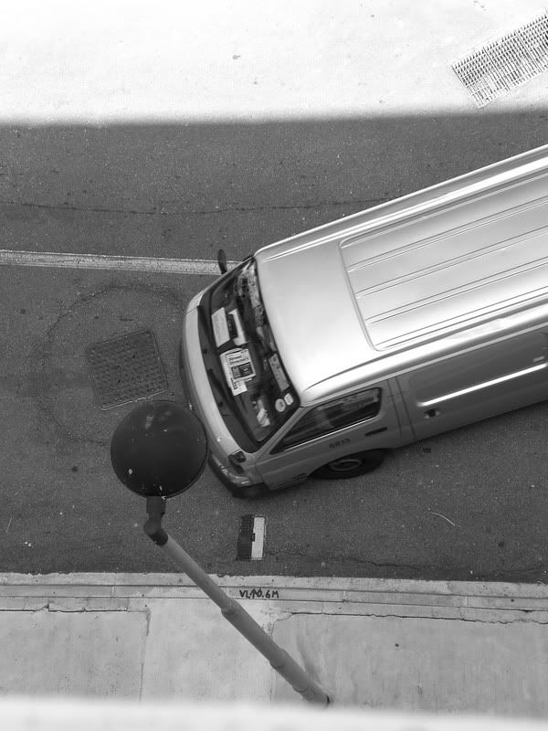
got it? ^^
[/edit]
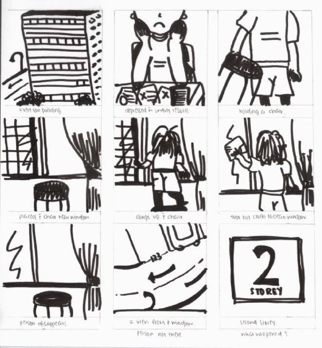
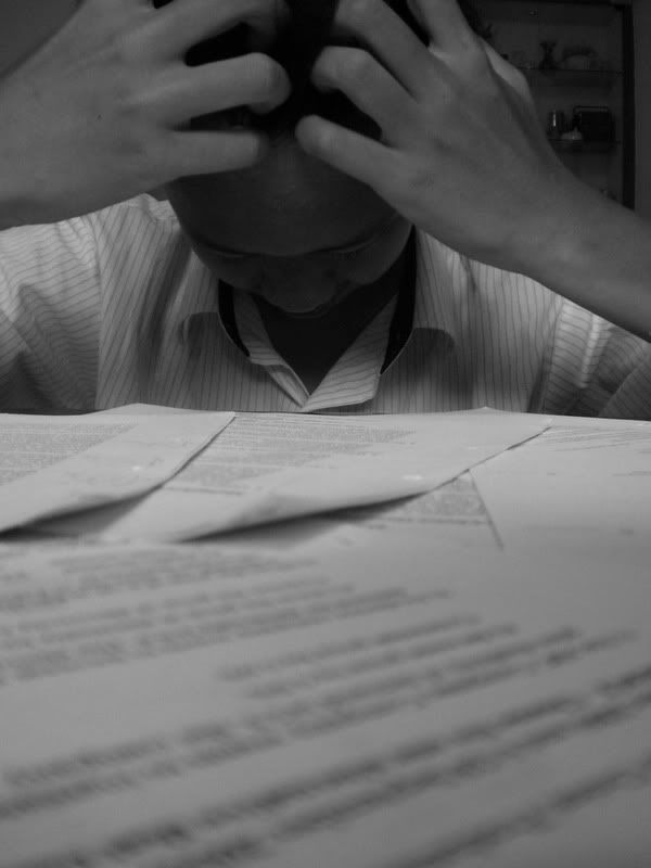
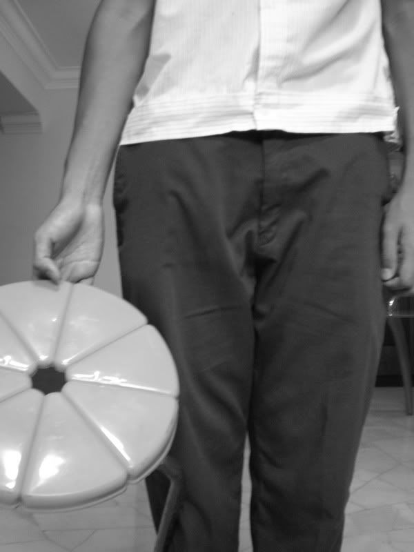
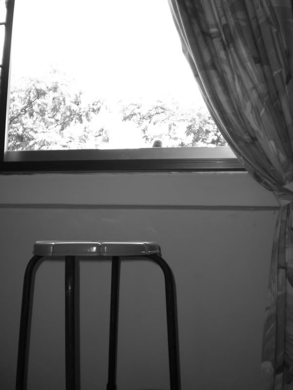
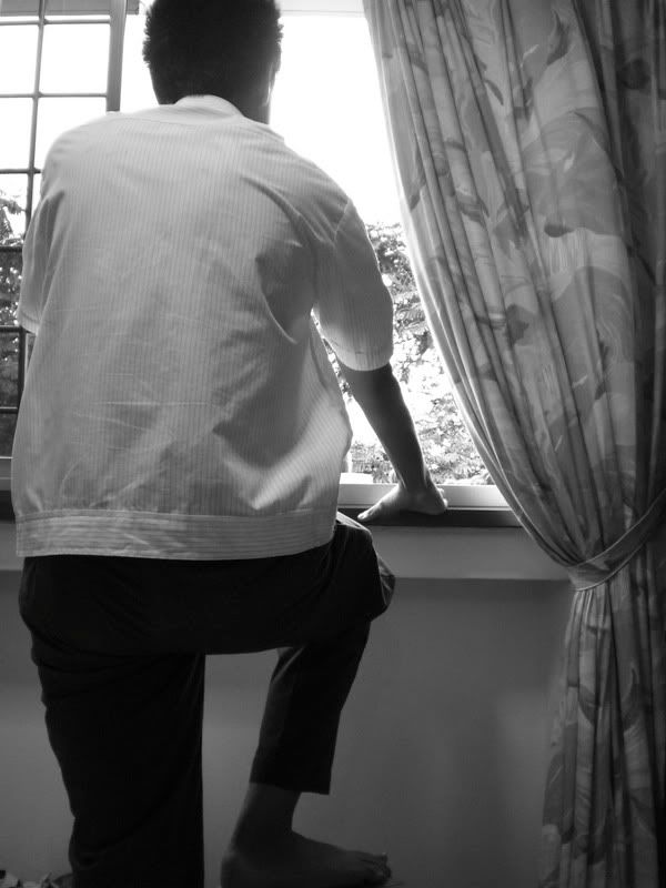
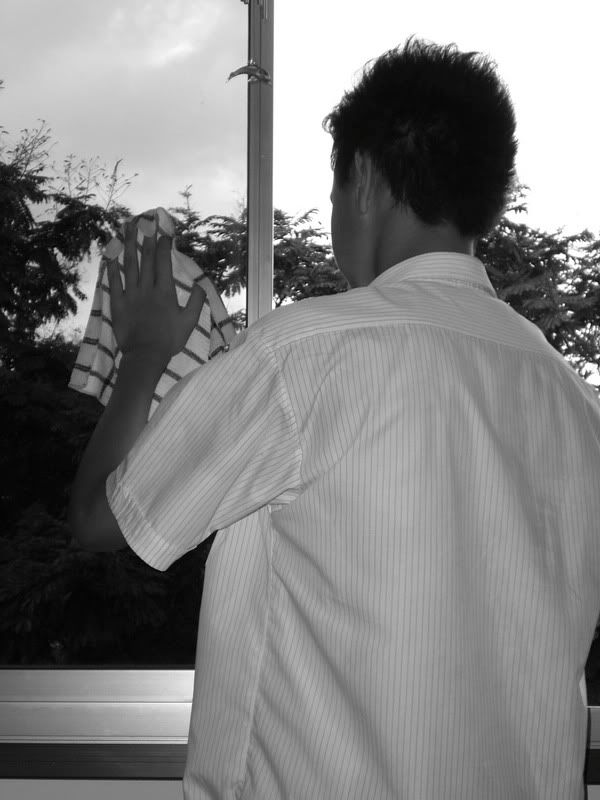
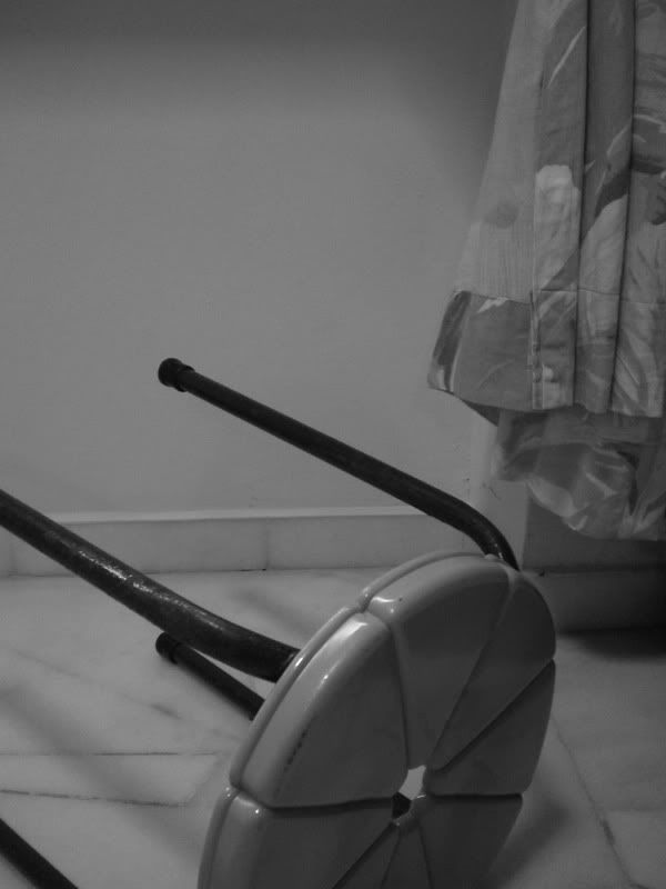
classroom exercise.
a picture that tells a story..
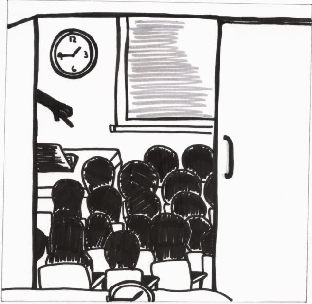
can you tell what the picture says?
a picture that tells a story..
can you tell what the picture says?
yeah.. time for the second assignment.. and while i thought it's gonna be a simple task.. since it could just be any representative image of an object.. the process of abstraction became harder as i proceeded on..
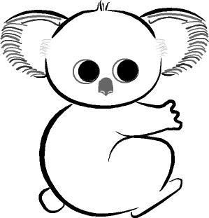
i took up the animal - KOALA.. since it was abandoned in my first assignment.. (:
was pretty enthusiastic about the topic.. and thus.. went searching around on the net to find out more about koalas and found a picture as reference..
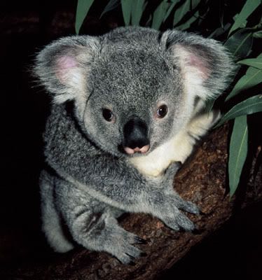
some information about koala.
koala (phascolarctos cinereus: meaning - pouch, bear, ash-colored)
three subspecies in Australia with different variations in hair color among each.
started off drawing detailed features of the koala.. naming its ears and its nose.. sketching was easy.. to do it on the computer posed a harder task.. did a simple version of my sketch.. and TA-DA,
down the process of abstraction.. i removed the complicated details of its fur.. and used simpler strokes..
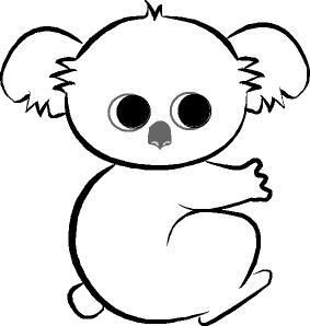
then i removed the body.. as the size of the bodies kinda determine the species of it.. thus..
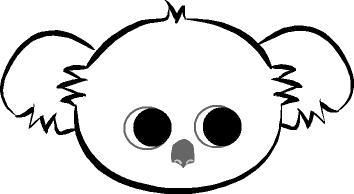
finally.. i dunno what else i can actually remove.. and therefore.. the eyes and nose disappeared..
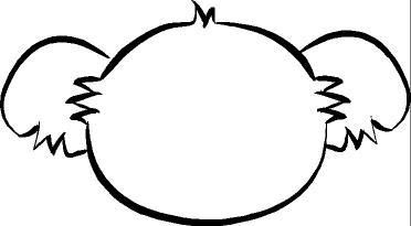
and becos we needed like 5 steps.. i was stucked! and probably the pretty ridiculous thing i did.. heehee..

but then.. thanks to all your suggestions.. my steps were a little modified and my symbol became.. *drum rolls*
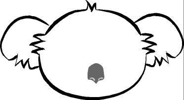
and thus.. the FINAL PIECE..
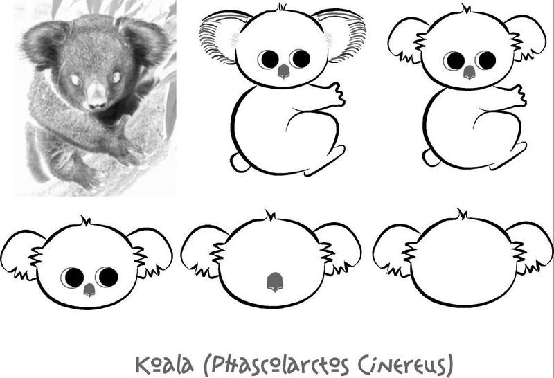
^^v.
classroom exercise.
we were asked to think of an object and draw the iconic and indexic versions of it.. and we did on a WATCH..
iconic was easy.. a watch with little details.. but the hands remained..
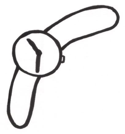
indexic was harder.. but yes.. the straps of the watch would be a symbol of the watch..
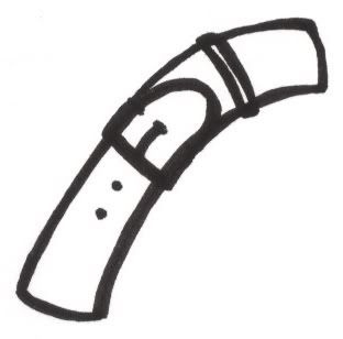
and yupyup.. DONE.
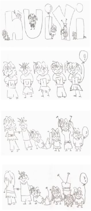
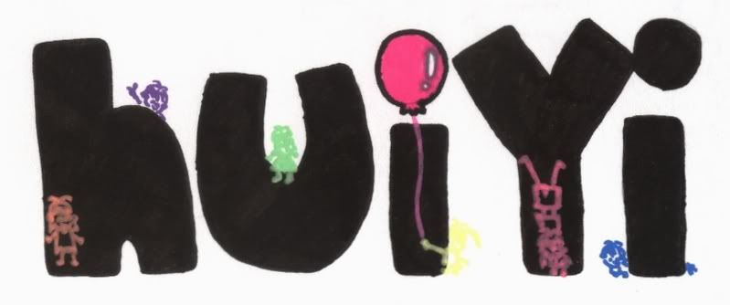
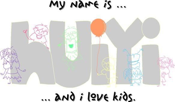
okie.. so basically.. our first assignment was to choose any two words and then design our name using those 'objects'..
was thinking through for two words and suddenly a lot of words came to my mind.. koala.. rainbow.. children.. flowers.. white.. pink.. can't decide on any.. hence.. seeked help from some friends.. and they gave me more words.. like BLUR.. ):
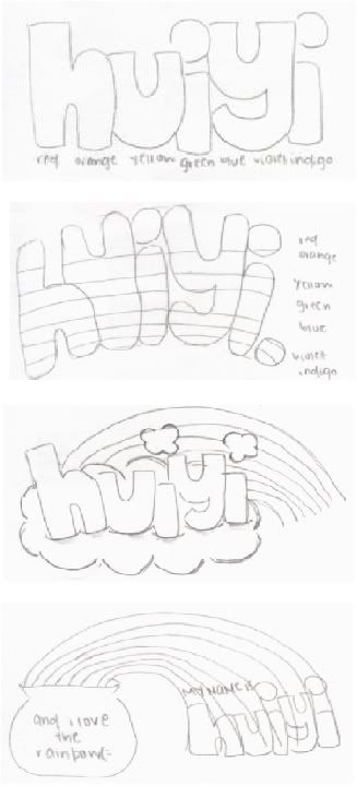
thus.. finally decided to work on KIDS and RAINBOW.. both that i like.. i totally can't think of anything that i seriously hate..
initially.. i really wanted to do white.. cos that's the color i like.. but it was really had to express white through drawings and designs..
THEREFORE,
[edited]
my thought process was pretty vague from the start.. wrong interpretation.. wrong understanding.. and thus.. work had to be done several times before everything was right on track..
after doing up all the eight sketches.. i decided to work on the first one for kids and the third one for rainbow..
THERE,
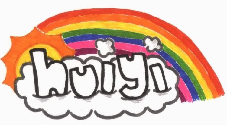
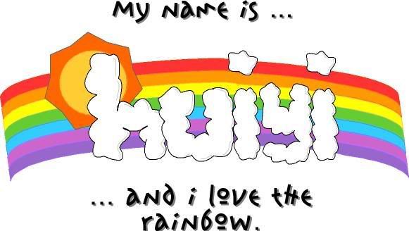
went for presentation during tutorial on the 3oth.. and finally realised everything wasn't correct.. and therefore.. had to come home and brainstorm again on how things should be done..
foreground and background differentiation.. the 'objects' had to make up the name.. and NOT part of the name.. this finally made me understand.. GOSH.. i have to admit that i'm pretty slow..
and FINALLY,
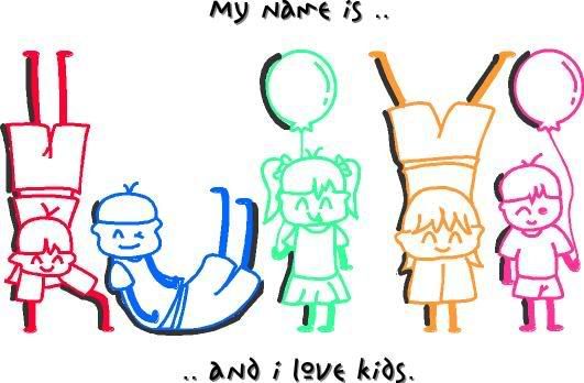
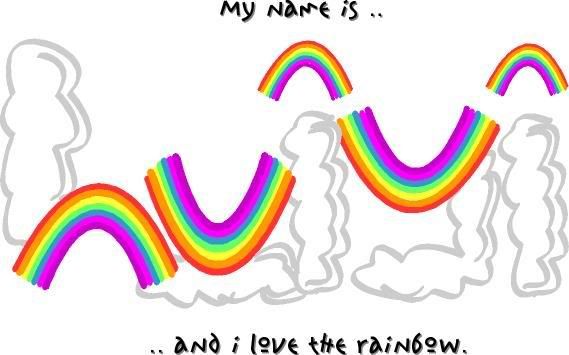
hmmm.. that's my two final prototype.. i hope it's finally correct.. ^^v.
[/edited]