talking about a bad poster.. i would DEFINITELY remember the lousiest poster i've seen on the movie - WAITING.
maybe.. the poster wasn't that lousy afterall.. but.. the show was bad.. so the poster designer might have decided to just come up with anything since the show isn't great either? haha.. that was just my personal opinion.. heehee.. =x
the story was supposed to be a comedy with A LOT of sexual jokes and criticism i would say.. and the whole 1 hour and 30 plus minutes was plain yawning and dozing off session for me and my friends back then when we watched it at some time past 12 midnight.. wat a time to watch a BORING show..
one thing probably that the poster has achieved was it's SUPER UNCLEAR meaning behind the design of the poster that had lead to people catching the show out of plain CURIOSITY..
my experience was..
becos we were left with not many other choices of movies to catch.. this warm-colored RED and YELLOW poster caught our attention in the cold and sleepy night..
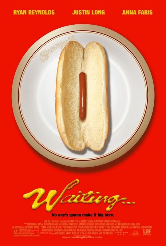
unable to properly derive the meaning of the poster and totally unaware of the synopsis of it.. we decided to try our luck.. and yes.. it's UTTER BAD LUCK. =x
though.. the image did drive us to a certain extend to somehow think that it was something related to food and probably a restaurant.. nothing other than that.. and definitely in no way had we thought that it would be a sexual movie though it was rated nc16 or m18 in singapore..
did some research on the movie.. and i found this poster..
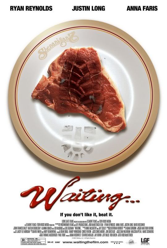
which i dun think i've seen it anywhere in singapore.. and probably this just displayed the similarity of the gestalt principles by using the similar image of food on the white plate.. but still i see and derive nothing else on it..
besides.. many reviewers commented that it was a horrible show too.. haha.. how interesting..
anyway.. what i thought was a bad poster becos of the influence from the BAD movie was afterall.. from the comments from my classmates.. a GOOD poster.. heehee.. and yes..
it possesses the qualities of a good poster.. catchy colours.. derivable meaning related to sex (that was only after explanations from my friends, i really didn't get it in the first place.. hmmm.. ).. borders.. gestalt principles like similarity and proximity.. so afterall.. it's good..
that's besides the point.. we did up the 'we thought it was good' poster from DREAMGIRLS.. (:
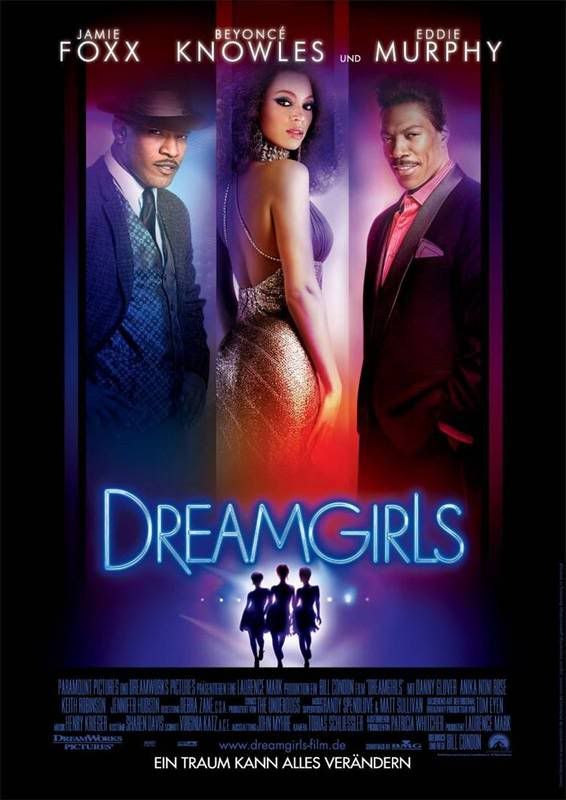
this is good.. the show's good too.. heehee.. obvious biasness.. =x
anyway.. it had a frame which enhances composition and great visual balance.. besides.. it showed similarity and continuity.. an organised.. simplified.. unified and easily understandable poster.. WELL DONE. ^^
becos the 'thought to be bad' poster turned out to be pretty good afterall.. we did a research on another poster..
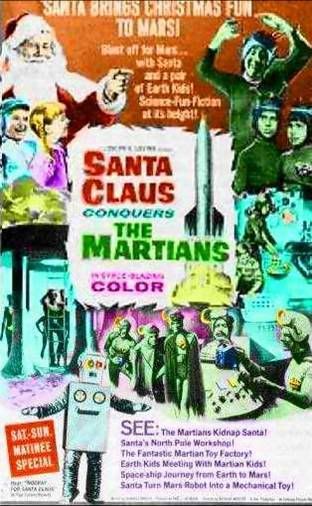
this one.. we had never watched the show before.. and from the poster.. we derived...... NOTHING.
okie.. something.. SANTA CLAUS conquers the MARTIANS.. eh.. yes.. that's basically all.. the poster used like a total of 5 fonts of different colours all over the place.. no borders and images will crowding the entire area..
generally.. no unity no harmony no contrast no nothing.. busy and pretty disturbing poster.. =x
oops.. these are all general opinions and remarks from ourselves.. hope we wouldn't be sued.. *crosses fingers*
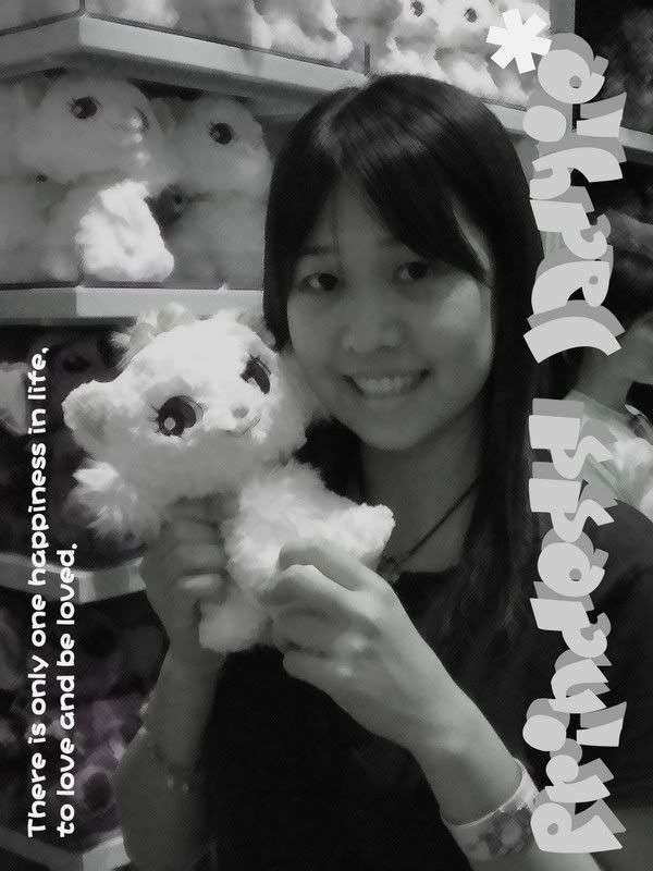
a greeting card design based on the theme - LOVE.
the theme that was given was pretty broad.. there's basically different kinds of love that we can do.. motherly love, brotherly and sisterly love, even friends are a GREAT deal of love..
i totally cannot decide on which to do on.. but when i finally realised our focus was on COLORS.. i was already 3/4 way to completion.. which kinda equates DIES.
i have no idea if what i've done is on the right track currently.. but shall wait till tutorial and see what can i edit to make it fit the assignment objectives..
yupyup.
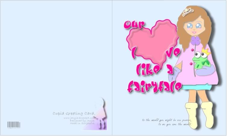
i've always like fairytales.. hence.. i've wished for love like the fairytales which usually end up with a happy ending.. (:
to me.. pastel colors kinda gives me a heart-warming and loving feeling.. thus.. the whole color theme evolves around the pastel colors of pink (romance, love, friendship).. light purple (romance, nostalgic feelings).. and light blue (divine love)..
our LOVE like a FAIRYTALE. ^^